Why ancient alphabets adorn a university icon
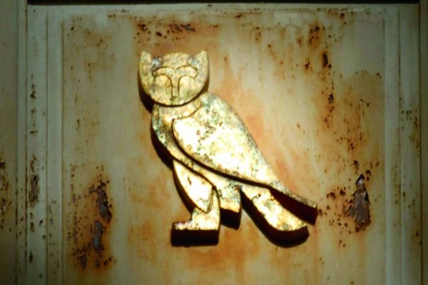
Upon closer inspection, they discovered what generations of students have seen: five different gold-leafed alphabets — Egyptian hieroglyphics (although technically not considered an alphabet), Phoenician, Hebrew, Greek and Latin — totaling 113 letters on the 73-year-old building.
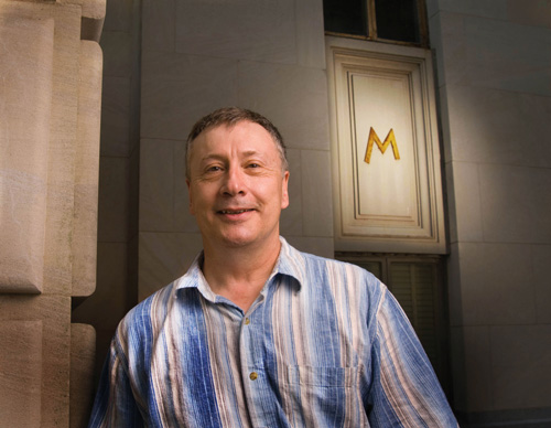
When the couple joined The University of Texas at Austin’s Department of Middle Eastern Studies in fall 2009, Huehnergard began to think about the letters again.
Thanks in part to a registration mix-up, he taught an unusually small undergraduate class of eight students. The class, Visible Language, focused on the world’s writing systems and gave him and his students the perfect opportunity to learn more about the iconic letters at the center of his new campus.
“In the middle of the fall semester I was walking past the building thinking about paper topics for the class and it hit me it would be fun to work on where these letters came from,” Huehnergard says. “I had asked around, but the consensus seemed to be the same. People know a lot about the building, but nothing of the alphabets.”
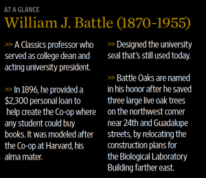
Huehnergard and his students traced the idea to William J. Battle (1870-1955), a well-respected professor whose strong influence on the campus design can still be seen today. It’s hard to find a building or even a tree on campus he didn’t touch in some way during his tenure as classics professor, dean and interim president. Most notable among them was the Main Building and its Tower, which Battle spearheaded.
World-renowned architect Paul Philippe Cret (1876-1945), educated in the Beaux-Arts tradition, wanted to design the building to be “the image carried in our memory when we think of the [University of Texas],” wrote Carol McMichael Reese, associate professor of architecture at Tulane University and author of “Paul Cret at Texas: Architectural Drawing and the Image of the University in the 1930s.” While designing with this aspiration, Cret paid careful attention to the need for a functional library.
Battle and Cret worked together to build a monument to learning, placing a symbol of the university’s intellectual aspirations and global ambition front and center for all to see.
The Assignment
“The class project began as an attempt to understand something most of us walk by on a daily basis — the letters on the Tower — yet rarely ever notice,” says John Lewis, a 2010 graduate who majored in government, Middle Eastern studies and history and plans on applying to law school in the fall. “We found that nobody was able to explain why or how the letters were placed there, and we decided to find out for ourselves.”
After a classroom discussion, the students began to research different aspects of the project. Who came up with the idea? Why those letters? What did it all mean?
One student looked into the history of architecture at the university. Another examined who was on the faculty at that time and might have known ancient alphabets and what resources might have been available. Another student scoured old course catalogues from the 1930s to see what classes were taught in theClassics Department.
Michael Redding, a 2010 graduate majoring in Plan II Honors and history, volunteered to look through Battle’s papers archived at the university’s Dolph Briscoe Center for American History. Battle was chair of the university’s building committee for nearly three decades as well as a classics professor with knowledge of ancient alphabets.
“We needed to find out where the idea for the letters came from, and since Professor Battle oversaw all of the building construction on campus during his tenure, our class decided that his papers would be a great place to start,” Redding says.
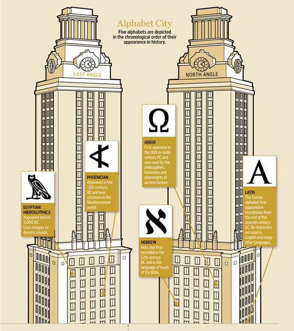
He scoured dozens of boxes. He searched through every memo and notebook entry Battle wrote during the era. Redding identified the very book and plates used as the models for the Hebrew, Greek and Latin letters, titled “Alphabets Old and New” by Lewis F. Day.
Redding’s biggest breakthrough came when he discovered on the back of a Greek quiz from the early 1930s Battle’s notes about how many letters to put on the building, and what languages to include.
“It was one of those unique archival finds that makes you smile,” Redding says. “It’s easy to imagine Professor Battle getting the idea while grading a quiz. And having no other paper to jot it down on, he writes out the basic plan that we’ve been trying to figure out all semester.”
The discovery helped Redding develop a deeper respect for archival research.
“It’s something most undergrads at UT never experience — even while writing my own senior thesis (“The Final Battle of World War II”), I never had to actually go to an archive and dig through all sorts of materials to find things out,” Redding says. “It actually helped me figure out my post-college plans because I’m in the process of applying to the School of Information’s archival program.”
Classmate Lewis focused on Cret, the prominent French architect who designed 19 buildings on campus, including the Tower, which was completed in 1937.
“I found that he intended for the buildings he designed to represent the character of the university, and for that reason, the letters on the Tower should be understood as an attempt to show the intellectual prominence of the university,” Lewis says.
The class was able to track down the foundry in Dallas where the cast-iron letters were made. Battle commissioned and approved the letters, which were brought to Austin on a flatbed truck weeks before then-President Harry Yandell Benedict (1869-1937) was informed. Nevertheless, all parties involved approved of the letters, which were fastened to the new building.
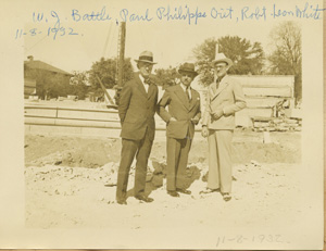
“Can you just imagine this truck coming in from the foundry in Dallas with a truckload of letters and someone had to be there to say that’s letter number one, that’s letter number two — they go in this order,” Huehnergard jokes.
Monument to Learning
The collaboration between Battle and Cret had begun several years earlier, in 1930, when the Board of Regents gave Cret the tasks of creating a master plan for the university and a library.
Jim Nicar, UT Heritage Society director, describes Battle’s interest in architecture as being almost as great as his fascination with ancient Greece and Rome.
“He took great care,” Nicar says, “to ensure that the design of the campus and its buildings were both appropriate to their setting in Texas, and reflected the high aspirations of the university.”
Cret knew just the spot for the library.
Unfortunately, that spot happened to be occupied by the Old Main Building, a gothic revival building completed in 1889 that was home to an auditorium, library, chapel, a women’s dressing room, classrooms and lecture halls.
Battle’s lecture hall, referred to as “The Greek Room,” was unique because students sat alongside Greek and Roman sculpture collected by the professor, which are now displayed in the William J. Battle Collection of Plaster Casts at the Blanton Museum of Art on campus.
“Cret takes one look at the campus and he says it needs to go right dead center of the campus and on the top of the hill. He successfully argues that it needs to be there because it is going to be the biggest building on campus — a library,” Nicar says.
Making that argument wasn’t easy. Old Main was the oldest building on campus and beloved by alumni.
In order to help allay public opposition, Cret designed the new library in two phases. The north wing of the Old Main Building, which housed the auditorium, had been condemned, so he put phase one in that back section.
Beginning in 1932, Old Main sat in front, and the new structure was added, consisting of 10 levels of book stacks, referred to as the annex. Eventually, 18 more levels were added, creating the Tower that now rises 307 feet.
 “That helps Cret. He’s getting his Main Building placed on campus, and that anchors the rest of his master plan,” Nicar says. “The idea was people would walk from Old Main to this nice new facility. Cret was fully expecting it to take until the 1950s. People wouldn’t be so attached and they would need more book space, and it would be okay to tear down Old Main and replace it with the front façade. He fully expected he would be dead, and would never see the Main Building complete.”
Oil revenues flowed into the Permanent University Fund, allowing the university to borrow from the fund one time only. A New Deal grant also allowed construction to continue much earlier than anticipated.
All the construction jobs on campus helped blunt the effects of the Great Depression in Austin. This led to the 1934 demolition of the Old Main Building, and Cret lived to see the crown jewel in his campus design come to fruition in 1937.
Cret’s exterior decorations for the new Main Building included the names of 14 men of letters carved in stone, such as Shakespeare, Aristotle and, the only American to make the cut, Mark Twain. Above the windows were 12 prominent university seals from such schools as the University of Paris, University of Oxford and the National Autonomous University of Mexico, the oldest university in North America.
“This is our monumental building,” Nicar says. “And what we are saying is we aspire to be one of those great universities. These are our peers.”
The five alphabets are part of this message about the university’s great aspirations.
As with many of the buildings built during Battle’s tenure, the letters on the Tower serve as an architectural clue to visitors of what awaits them inside.
Over the years, the elements have taken their toll on these letters, corroding away at the cast-iron with their golden façade. Some campus groups are in the early stages of talking about restorations to the iconic building.
But the history still remains for all those who pass by to see.
“The letters represent the history of the alphabet, and, by symbolic extension, the history of learning,” Huehnergard says. “A fitting decoration for an edifice that was built as a library and as a symbol of learning and knowledge at the university.”
View slideshow of Tower letters
