LESSON 1: MAPS CAN KILL
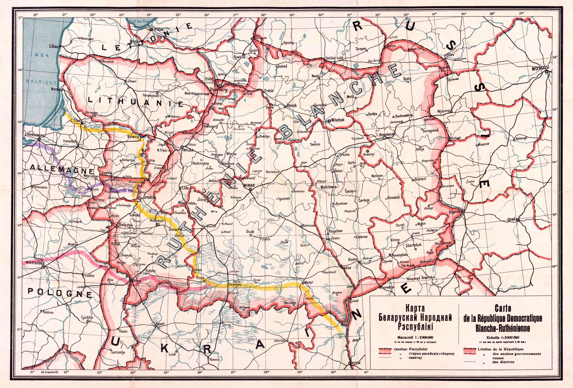
In 1930, Belarusian soil scientist and cartographer Arkadz Smolich was arrested, transferred to interior Russia, and ultimately executed during one of Stalin’s purges. His crime was drawing a map. The offending map, which depicts the Belarusian National Republic (BNR), was made in 1919, years before Stalin’s rise to power. But even then, it was not a politically inert object. To understand why, one needs to know a bit about both history and mapmaking.
Let’s start with the Belarusian National Republic, which didn’t technically exist in 1919, having declared its independence from German occupation in 1918 only to be conquered by the Russian army the following year (the Treaty of Riga in 1921 subsequently would divide Belarus between Soviet Russia and Poland). Smolich created the map not to record solidly established borders but to advocate for Belarusian national self-determination. It was, like many maps, aspirational.
We can see this in several visual choices made by Smolich, explains Steven Seegel, a professor of Slavic and Eurasian studies at The University of Texas at Austin. Most notable is the thick red line, accented with pink shading, that announces the supposed Belarusian border (Figure 1). Smolich could have employed a more subtle dashed line, but he opted for a bold statement with a color scheme associated at the time with the demarcation of the sprawling British Empire. Thinner red lines acknowledge the historical parishes of the Russian monarchy, but these are dwarfed by the prominent border of Belarus, which sits at the map’s center.
Another calculated design choice was the use of the French language. Nation names on the map appear in French, which was the language of European diplomacy during the early 20th century, and the map’s legend is shown in both Russian and French. Its use indicates that the map was not created to help Russian soldiers find the best route to Minsk but rather to convey to the whole of Europe that Belarus was a nation deserving of independence. Naturally, none of this sat well with visions for a future Soviet Union.
“The moment when geographers begin thinking of geography not as a science but as a political tool is a dangerous one,” says Seegel, who chronicles Smolich’s life and death in his paper “Murder of a Transnational Map Man: Ideology, Scientific Expertise, and the Fate of Revolutionary Belarus in the Life and Work of the Geographer Arkadz Smolich (1891–1938).”
Tragic as Smolich’s individual story is, the dangers posed by maps are not just to those who draw and disseminate them but also to the people living in the regions amidst the lines and dots on paper. Maps have been used by political leaders to claim territories and wage wars, their veneer of scientific accuracy a way to justify invasions and ethnic cleansing. “I’m fully aware that maps can kill, and that’s one of my starting principles for a lot of the work that I do,” says Seegel.
A historian of Eastern Europe specializing in critical cartography, the practice of analyzing the agendas and power structures underlying maps, Seegel has written several books about the complicated lives of maps and their makers. As he sees it, the two are intricately entwined. Cartographers may present their maps as neutral reflections of reality, but every map harbors the unique biases and ambitions of its creators. Seegel is fascinated by the stories maps tell, what they choose to focus on, and which people and perspectives they include or exclude.”
LESSON 2: MAPS LIE
All maps are distortions in one way or another. In the most literal sense, maps must distort because they are representing the curved surface of the earth in a two-dimensional space, making it impossible to display all physical properties accurately. The transformation from three to two dimensions is called a “projection” and is one of three fundamental properties of maps, along with scale (the distance between things on a map versus those things in the world) and center (what’s in the middle).
Probably the most famous example of projection distortion is the Mercator world map, which preserves the accuracy of shapes and angles by sacrificing accuracy in area. It’s great at depicting the contours of coastlines but grossly inflates the size of landmasses furthest from the equator (which conveniently includes Europe and North America), making Greenland and Africa appear equivalent in size despite the latter being about seven times larger than the former. Scale and center have their own pitfalls. If you
attended primary school in the U.S., you may have been subjected to a world map that awkwardly sliced Asia into two halves so that North America could sit center stage. But there are also more subtle distortions to be found.
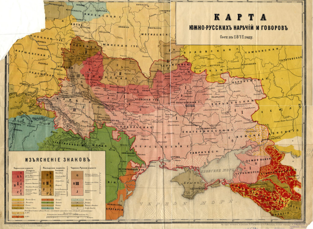
Even when they aren’t explicitly advocating for the creation of a new independent states, as with Smolich’s BNR campaign, maps often have an underlying agenda and opt to emphasize or omit information in its service. Take this colorful creation by Ukrainian ethnographers Pavlo Chubynsky and Kostiantyn Mykhalchuk, using language data from 1871 (Figure 2).

Nominally, the map is intended to depict southern Russian dialects. Russia itself, however, is strangely absent. The map colors represent a variety of dialects spoken in Russia’s borderland, including Romanian in the south in green and Belarusian in the north in beige. The largest and most central portion of the map is devoted to Ukrainian dialects, depicted in various shades of pink (which, like Smolich’s Belarusian border, evoke a sense of dominion). The map was made for the Russian Empire, but its creators were both, to use a term I learned from Seegel, “Ukrainophiles.”
“Each map is a centrism,” Seegel notes. “It might be U.S. centric or Eurocentric, or race or nation centric, but there is a fixed point, and that fixed point is very revealing.”
The map prioritizes Ukraine by prioritizing Ukrainian language, in the process creating an implied border of what could potentially be an independent Ukraine. It’s accurate, to a point, but it has an agenda. In this case, Seegel points out, the map privileges rural regions, where Ukrainian could be claimed as the majority, and downplays the existence of the multiethnic, multilingual, and Jewish populations found in many of the big cities of the Russian empire.
“All maps lie,” says Seegel. “Or at least there’s a slant to them. If you don’t put the spotlight on the capital city — Moscow, St. Petersburg, Kyiv, whatever it might be — then you’re actually sliding on that slippery slope toward a particular orientation, and that’s what I see in this map.”
The southern Russian dialects map may be an example of cartographers using maps to covertly promote national self-determination based on linguistic distribution, but the same tactic can also be used to undermine independence. Today, claims of linguistic majority are used by Vladimir Putin to justify Russia’s occupation of Ukrainian regions where Russian is spoken, ignoring the fact that many people throughout Ukraine speak multiple languages.
LESSON 3: THE MAGIC OF MAPS IS PERSUASION
Victor Orbán made quite a splash at a 2022 soccer match between Hungary and Greece by wearing a scarf emblazoned with a map of “Greater Hungary.” The term refers to a Hungary imagined with the border it enjoyed prior to the end of World War I, when the 1920 Treaty of Trianon trimmed Hungary to its current, compact size. The countries to which the defeated Hungary had ceded land as part of that treaty, including Ukraine and Romania, were not thrilled with its present-day prime minister’s fashion statement. Ukraine demanded an apology and Romania and others condemned Orbán’s none-too-subtle promotion of an ideology aimed at recapturing those lost territories.
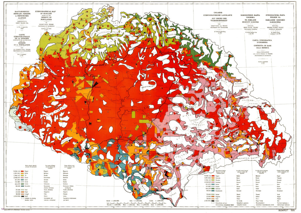
Long before Orbán’s scarf, another map argued against the partitioning of Hungary. The Carte Rouge was created by Count Pál Teleki, whom Seegel writes about in his book Map Men: Transnational Lives and Deaths of Geographers in the Making of East Central Europe, in anticipation of concessions to be demanded from Hungary during peace talks with the victors of World War I
(Figure 3). An ethnographic map based on a 1910 census, the Carte Rouge depicts the linguistic populations of Hungary with Hungarian (or Magyar) speakers indicated by a dazzling candy-apple red. The result, which Seegel notes looks like a brain, is a striking, almost overwhelming sea of red. Small urban pockets of German and Slovak dotting the interior (indicated in less vivid colors) all but vanish, not unlike how the blue cities of Austin and Houston are swallowed by the red of rural communities in maps of Texas voting patterns. Areas with less red — toward the map’s borders and encompassing a large chunk of its east and south — display conspicuous patches of white with black outlines. They look like large lakes, but the map’s legend informs us that they are uninhabited and “relatively uninhabited” lands. This, Seegel explains, is a deliberate attempt to depict regions not dominated by Magyar as wastelands without significant amounts of other ethnicities, when in reality they were likely populated, if sparsely, by Romanian speakers and others. It is a visual argument against dividing Hungary. Sure, there’s some Romanian spoken in the east, but not enough to justify cutting it loose. Best to leave the borders as-is.

The tactic of representing disputed lands as unpopulated had already been deployed in the American West, where Teleki had traveled and seemingly taken notes, in order to diminish the presence of Indigenous populations.
“He had traveled to Santa Fe, he had seen the Rockies,” says Seegel. “He was well aware of these tricks that you could use on the frontier in geography in white Colonial America to erase entire populations. It’s a way to say that a particular group is surrounded and therefore that it would be undeserving of a political unit. I mean, try putting together a map of Romania out of this. You can’t.”
The Carte Rouge was one of the most circulated maps of its era and inspired similar maps in Hungary as well as in other countries. Ultimately, Teleki’s cartographic lobbying failed and Hungary was reduced to a landlocked country less than a third of its pre-war size, but the Carte Rouge’s claims about ethnicity, and thus about appropriate borders for Hungary and its neighbors, were not entirely unconvincing. The dream of a Hungary with its pre-Trianon territories intact has persisted into the 21st century, finding expression in right-wing factions and the occasional soccer scarf. That ability of maps to influence public opinion lies at the heart of Seegel’s work in critical cartography.
“There’s a sublime and a subliminal component to this,” he says. “The sublime is that when you draw a map it takes on a life of its own. And then it circulates in media and it becomes almost unquestioned as a model. The subliminal is what I’ve been trying to get at in my writing, because these maps are seen as so rational. That’s where the role of art historians and media specialists and people who know their aesthetics can come in. Because you could draw another orientation to this map. You could have Hungarians in white instead and greater prominence to some other population. There’s a magic to this, the magic of maps’ persuasion. And the point, especially in the cutthroat world of diplomacy after World War I among the nationalists, is persuasion.”
Seegel hopes that contemporary mapmakers will see their craft in part through the lens of critical cartography, that they will understand the subjectivity of the visual choices they make. They aren’t merely recording the world as it is, because no one map can encompass all that information, but rather weaving a reality with potentially broad effects.
“If you draw a map, you should be reflective about the ethics and ethical principles that go into it,” Seegel advises. “I want people who design maps to know history and to know surprising and unexpected histories. You should also think of your city as full of people and full of people in motion. The trick is to figure out how to represent that traffic — people who are coming and going, staying or leaving — and trying to figure out the why behind that. Why do they want to stay? Why do they want to go? Who is forcing them to stay or go? What binds you to a place instead of just passing through? I stress in my mapping courses that every place, no matter how generic, even a shopping mall or a parking lot or an airport, has a particular history. It was built as part of the built environment at a moment in time, and it’s represented imperfectly.”
